USA Today is an iconic brand. Rethinking its digital presence was a big ask, but bigger knowing it was done to prove the product’s scale could be pushed beyond its current boundaries.
A new brand leads the way
A new brand set in motion several key steps on our year long journey to remake the experience.


A new digital flagship sails
Informed by several key phases of work: discovery research, innovation discovery, ux strategy and creative concepting, we endeavored to understand who we were designing for, the business needs, the product’s potential and how we could represent USAToday apart from its industry partners.
Discovery: In this phase we strive to identify the business goals, and the market opportunities. Who is our customer? Where are their core pain points and how do we better serve their needs? How do we create a superior ad experience for advertisers and customers?
Innovation: Informed by the previous phase, we set out to deliver on the data gathered for an experience that innovated against the marketplace.
User Experience: The user experience and architecture phases of work are meticulously mapped out in this body of work and tested in order to create a simpler, more engaging journey for the customer.
Creative Ideas: With the infrastructure in place, the concepting phase begins. We elevate the brand and maintain a system whereby we minimized pain points we discovered and maximized their time within the experience as positive.
The time spent on research yielded information on how users consumed content and gave USAToday their guiding direction and core principles of design. A simplicity formed around the usability driving the UX/architecture to be as flat as possible.
Users didn’t land on home pages or main sections organically. That wasn’t the behavior. Likewise they didn’t consume news the same during the day or evening equally. The design had to respond well to a wide array of personas driving consumption across digital properties.
A two level framework was created. Section then page, with an alternative special section as needed.
Innovating on the original
Improving on the 2012 relaunch meant we needed to know more about what our customers needs were - and how the industry was evolving. A hard look at how our customers were navigating the site and digesting content opened up opportunities for creative thought around data, context, architecture and space.


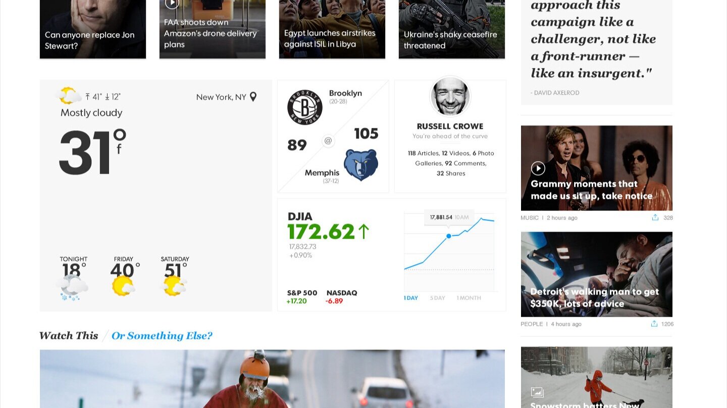
The brand colors, very important to the marquis USAToday history were used to drive home functional storytelling rather than just used as a brand accent for top level navigation where they were usually ignored. Contextual data visualizations were used to pair adjacent stories to create compelling areas of content consumption.


Data and design could drive time on site. That was true for any template we created whether news, sports, tech, entertainment or business. If you cater to your customer’s needs correctly you’ll design the right experience for them. Stitching them all together was a balancing act in technology partnerships and research.


